

YCloset offers an online clothes subscription service. Each month, subscribers can access
150,000 mid-to-high-end clothing options for a subscription fee of $80. As the design lead, I participated in the process of creating the
Ycloset app from scratch. This project showed how our team approach and iterate YCloset’s app.

Unlike its European and US equivalents, such as Rent the Runway, YCloset offers everyday attire instead of just formal occasion clothing. The value proposition is providing access to a huge variety of clothing so that people can try out new styles regularly without having to make purchases. The target customers are urban white-collar women aged 20-35, who face pressure to dress well (even beyond income level) at their workplace.
The challenge
Customers want flexibility, convenience, and the latest styles, but a high turnover of clothing by China’s urban middle classes is costly both to customers and the environment. Ycloset provides a new solution to tackle these problems.

Market Research
To conceive the best approach to our product, our team wanted to get a deeper understanding of YCloset’s target users. Thus, our product team collaborated with the marketing team initiating market research focus groups. We collected 1839 samples from an online survey and interviewed 3 groups of target users who talked about their own thoughts, feelings, perceptions, and opinions about fashion and our services. After the focus group, my team and I analyzed the qualitative data and turned it into a research report to create a more precise brand image, visual communication, and design language.

Branding Research & Style Guide
After the focus group, We also started working on visual and brand research. We proposed that a hybrid of Instagram and “Chinese-style” app will be the most suitable branding for our product. Thus, our biggest challenge was to create a sense of western fashion, like those light-luxury brands for youngsters, while mataining the intricated functionality of e-commerce and providing the best practice of user experience for Chinese users.
Style Scope
We concluded our style scope that consists of three apsects: emotion, tone and styles. In emotion, we choose bright and delightful as the feeling. In tone, we pick high-contrast and high-saturated photo as our content. In styles, we choose flatlay, flat graphics and collage for our visual presentation.
Design Process
When designing the app, our team worked closely with the development team and research team to define the problems based on user data. We iterated the design process by prototyping and usability test. We also ran A/B testing to compete for a better version of layout or style to increase the conversion rate.


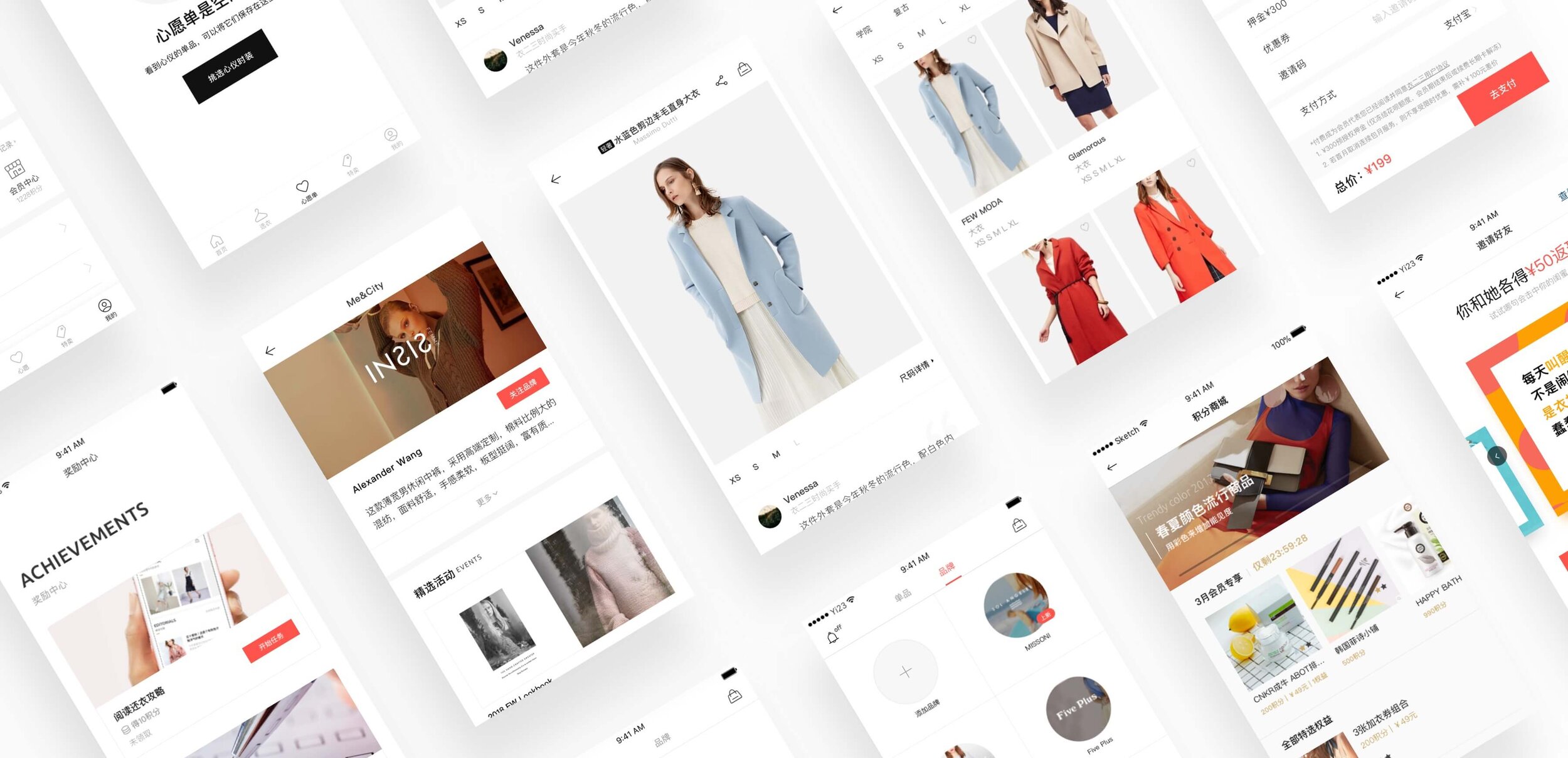
UI Style
The UI style of Ycloset is minimalism. We used a visual language that was clean and had a lot of white space. This style has been seen in popular apps like Zara, Instagram, and Airbnb. The benefit of this style is that it helped users focus on the content, and it provided a sense of fashion magzines.

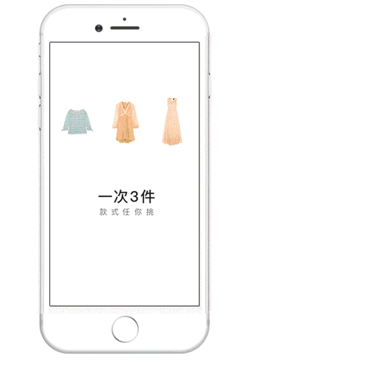
Onbaording
We made an 1 minute animation for a quick user guide. The animation gave user a more intuitive and concise explanation. There are three rules for our service: users can ren 3 items in one order; no additional charge for laundry and logistics; no mandatory return date for each order.

Prototyping
We really emphasize on prototyping. We use Principle and Origami Studio to simulate a real environment on the mobile phone. In this way, we can convey our vision with lower time and human resource cost.

Prototpye made in Origami
Offical Website
Our pc official website is mainly for promotion. We put more attention on how to play and business model. We designed a RWD layout so that the website can adopts to different platform on different devices.

Compare to 2017’s design, we add a getting coupon setion at the beging of the page in 2018. In order to make user understand how to play and bussiness model. Besides, we put more informations and details on laundry.

UI Kit & Guideline
We created an UI kit and guideline for our design team and developers. We make sure all our design follow guideline and style. We update guideline and UI kit constantly in every version.

